Project description
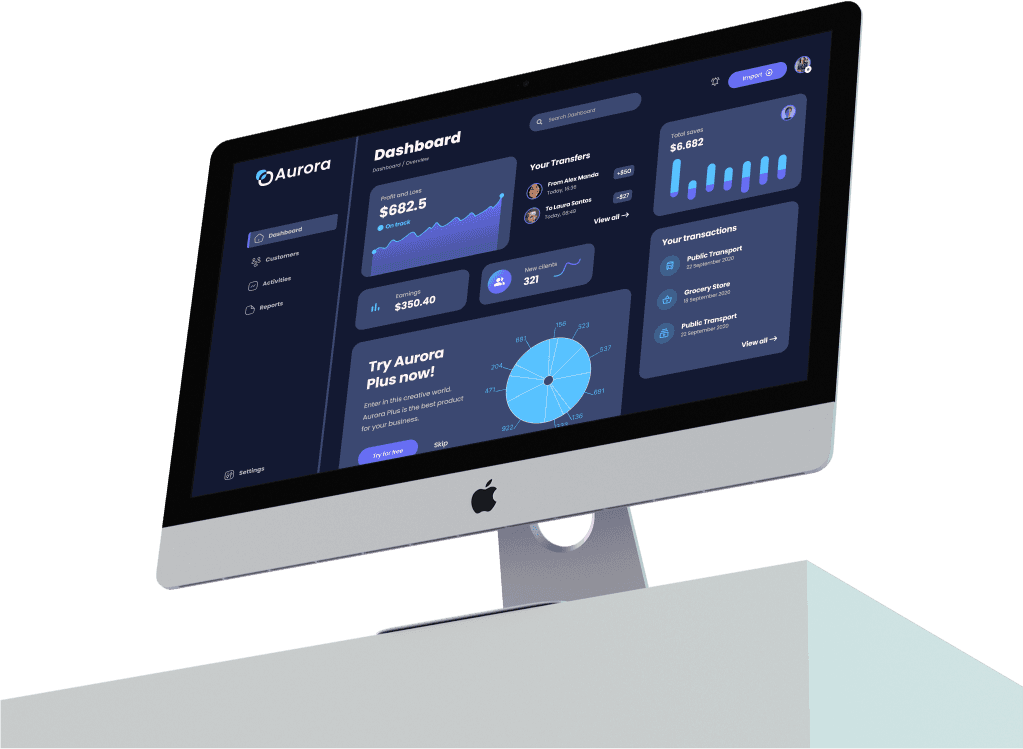
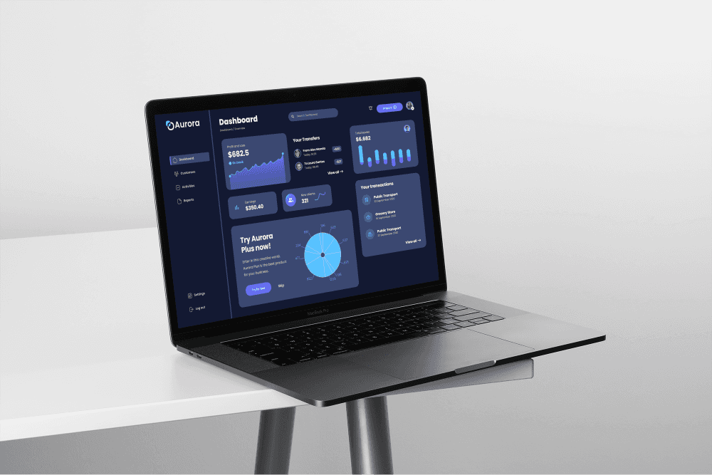
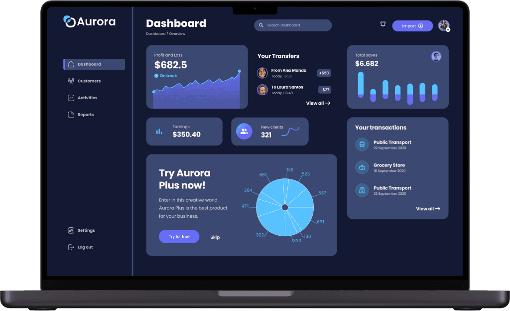
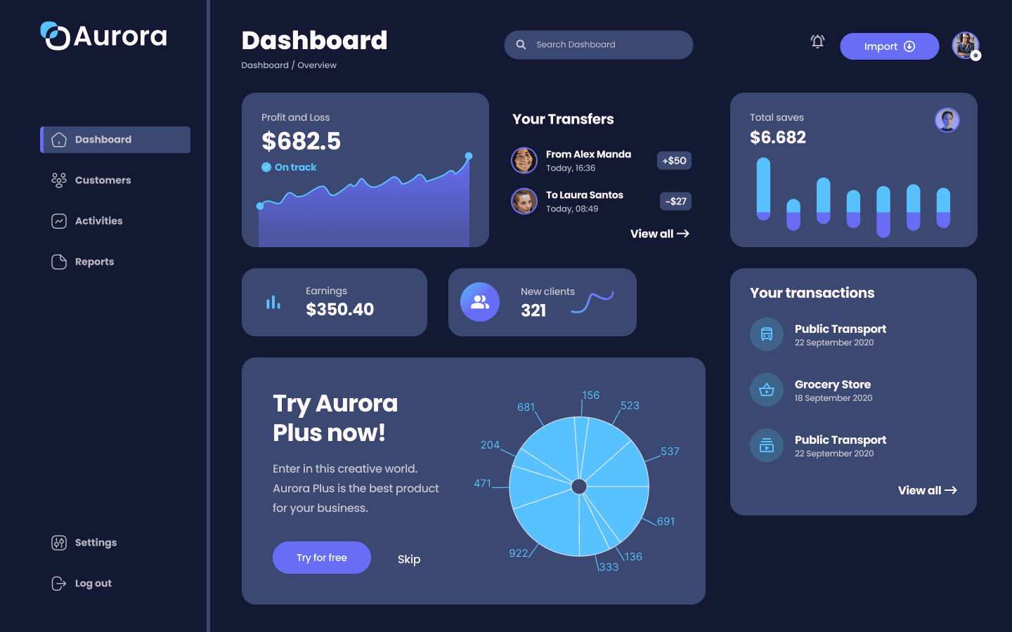
Redesign a financial dashboard's user interface to increase data visibility, usability, and aesthetics. Users regularly complained about having trouble discovering important information and navigating between portions of the crowded, outdated UI.
My role
Solo UI Design
Problem
1 - Visual Clutter
Too many elements competing for attention, leading to user overwhelm.
2 - Poor Data Hierarchy
Important data points were not emphasized, making it difficult for users to quickly grasp key information.
3 - Complex Navigation
The menu lacked essential tabs for "Activities" and "Reports," which are crucial for user tasks, causing frustration and inefficiencies.
Improvements

Outcome
1 - 60% Improvement in Task Completion Time
Users were able to find and interact with key data faster, especially within the newly added "Activities" and "Reports" sections.
2 - Positive User Feedback
Users praised the clean design, the inclusion of the missing tabs, and the intuitive navigation, reporting a more pleasant experience.
3 - Increased User Engagement
The dashboard saw a 40% increase in usage, with users spending more time exploring features, particularly the new tabs.
Conclusion
This project demonstrated how crucial user-centered design is to creating a simple, easy-to-use interface from a complicated, crowded one. The redesign of the dashboard addressed the crucial problem of missing important navigation features, which not only made it more aesthetically pleasing but also greatly improved the entire user experience.
THANK YOU

