Project description
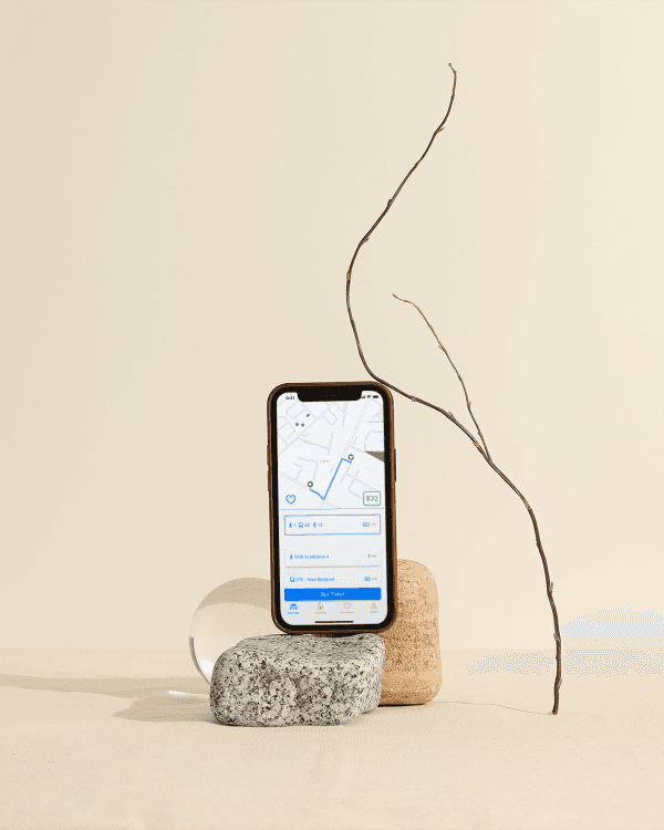
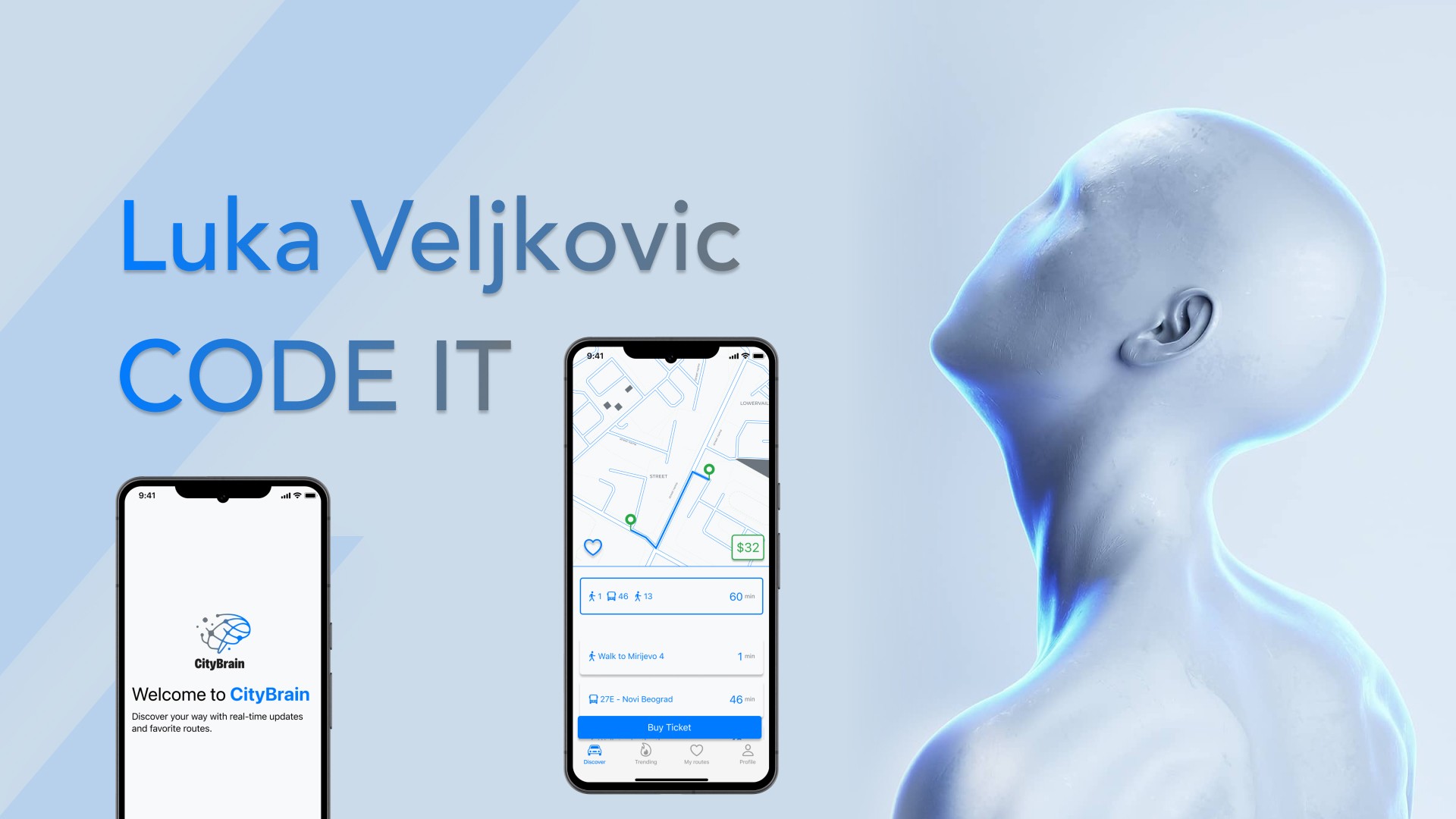
The purpose of this project is to create a smartphone application that improves the commuting experience for users of public transit. The app should allow users to simply search for schedules, save their favorite routes and stations, and receive real-time updates, all from a user-friendly and visually appealing interface.
My role
Solo UI & UX design
Problem
1 - Poor User Experience
The user interfaces of modern transportation apps are frequently crowded and difficult to navigate. Key functionality such as schedule searches and favorite route management are hidden behind complex menus or displayed in an unintuitive manner, making the app hard to use.
2 - Inefficient Route Management
Commuters frequently take several routes or stations based on their destination or time of day. Without a quick and effective means to access these routes, users must explore the entire program to locate the information they require, which causes aggravation and wastes time.
3 - Missed Opportunities for Seamless Travel
The lack of online payment integration breaks the flow of a smooth commuting journey. Instead of easily boarding the bus or train after a short online payment, consumers must discover alternate payment methods, such as purchasing tickets at physical kiosks or with cash, which can be time-consuming and inconvenient.
The Solution
1 - Clean, Minimalist Design
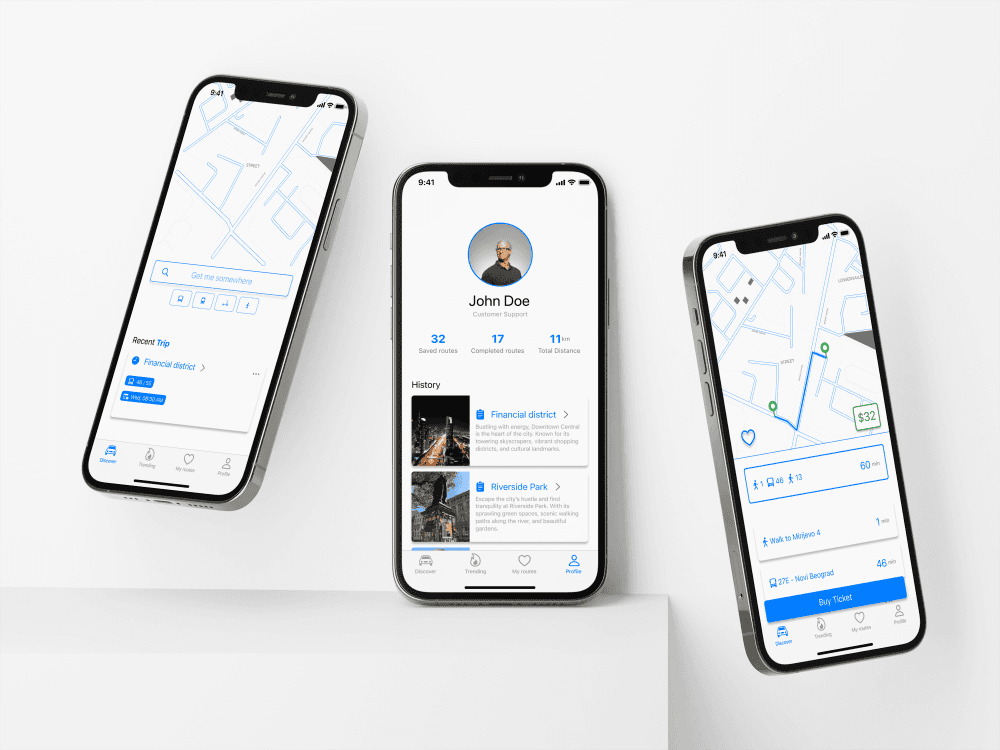
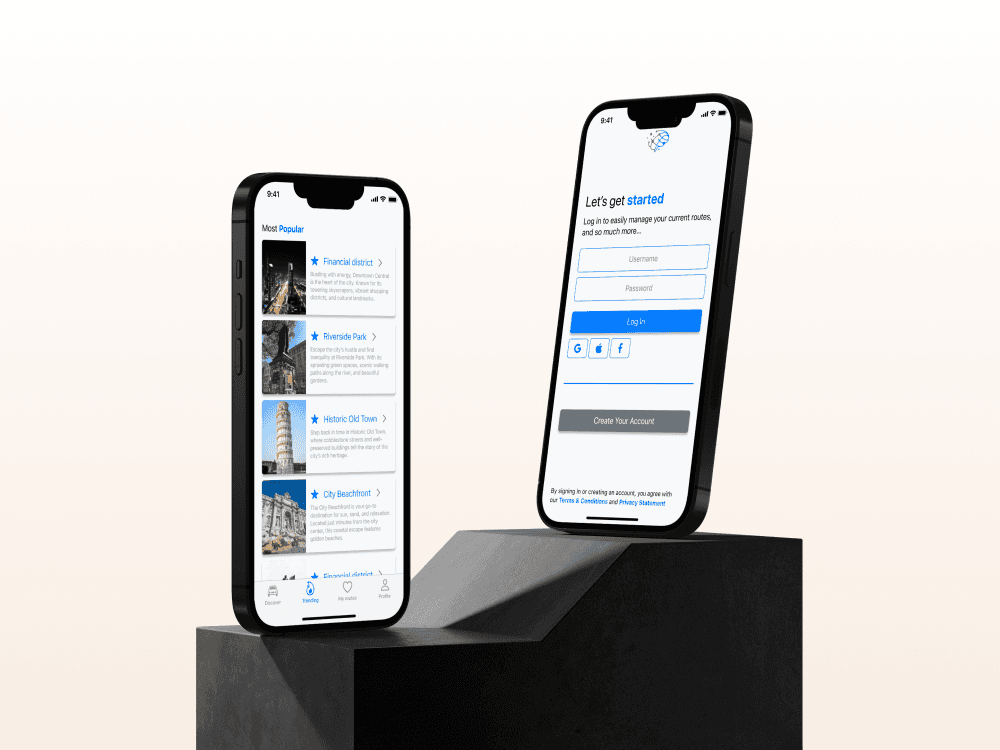
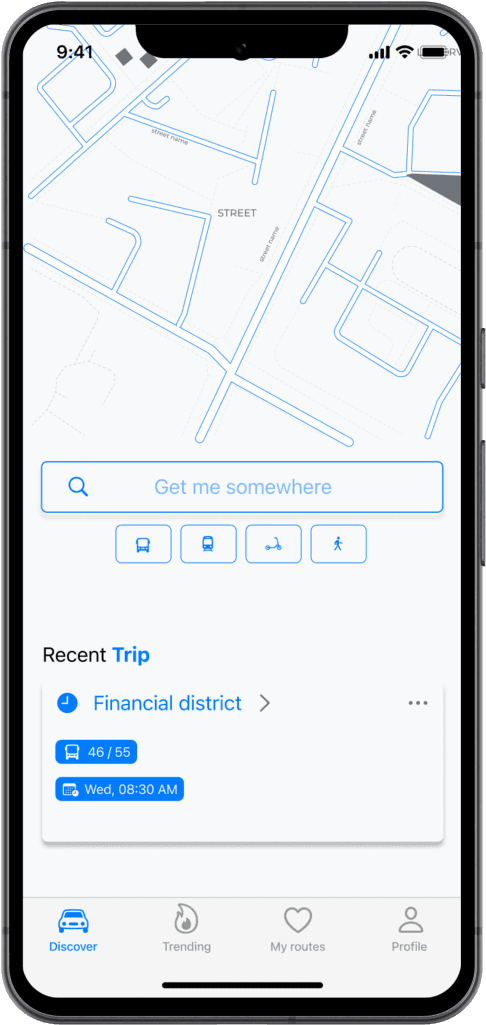
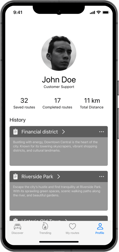
I used a clean, minimalist style to reduce visual clutter and highlight the most critical elements on each screen. This strategy prevents consumers from being overloaded with too much information at once, making it easier for them to find what they need.
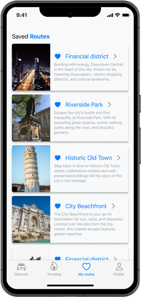
2 - Favorites Section
The app now has a separate "My Routes" area where users can save and organize their most frequently used routes. This tab is easily accessible from the bottom navigation bar, allowing users to rapidly retrieve saved routes without having to perform several searches.
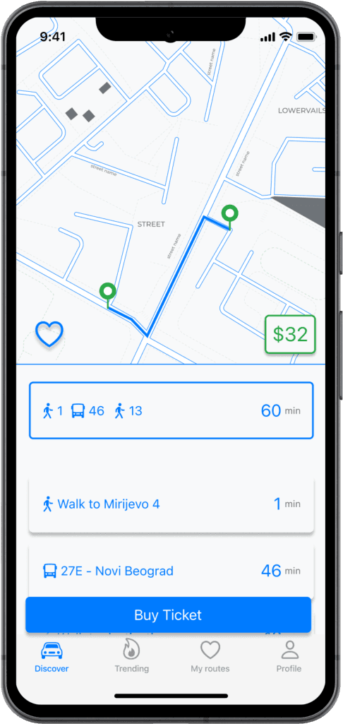
3 - One-Tap Payment
To make the procedure easier, I added a "One-Tap Payment" function. Allowing them to pay for their trip promptly without going through multiple processes. This function is especially handy for regular commuters who need to make quick payments during peak hours.
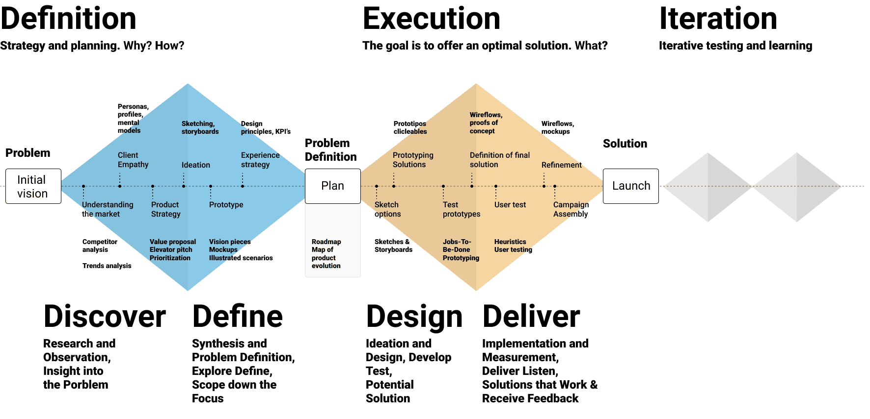
Design Process
User Research
I spoke with three potential users in order to determine the main features that they would like to see in our app. What they said was as follows:

1 - Easy Navigation
"My goal when opening an app is to quickly find what I need. I find it very crucial that a homepage be straightforward and easy to use. I have no time to trawl through intricate options." - Emily Jones

2 - Favorite Routes
"I travel a lot for work, and I often use the same routes. Being able to save my favorite routes would save me so much time. I don’t want to have to search for the same routes over and over again." - Jessica Tuckwood

3 - Visible Price
"One thing that frustrates me is not being able to see the price clearly. I want to know exactly how much something costs without having to click through a bunch of pages. The price should be clear and easy to find." - Mary Clarkson
Competitive Analysis
1 - Google Maps
Strengths: Google Maps provides comprehensive route planning, real-time traffic information, and interaction with a variety of transportation modalities. It is widely used and trusted worldwide.
Weaknesses: However, its interface might be overloaded with too many options, making it overwhelming for individuals who only utilize public transportation. Also, saving and managing specific routes is not as simple.
2 - Moovit
Strengths: Moovit is a comprehensive public transportation app that offers real-time arrivals, service notifications, and trip planning in many locations.
Weaknesses: Although Moovit has many features, the UI can be confusing due to the amount of information shown. Saving favorite routes and making purchases within the app are not as simple as they could be.
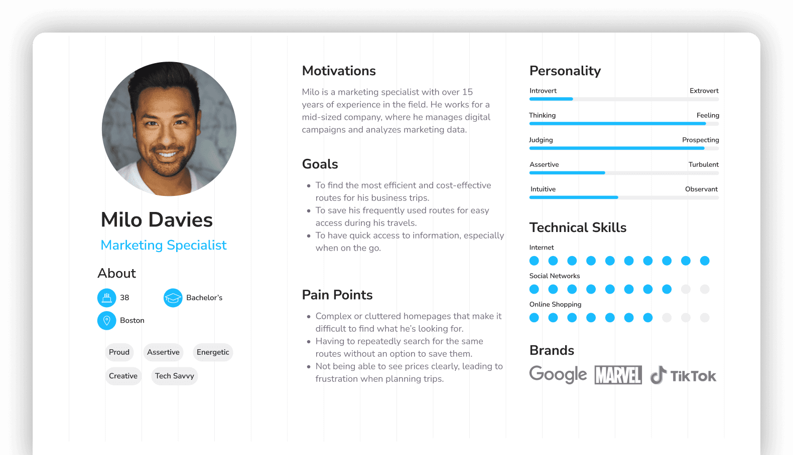
User Persona
Sketching
Low Fi Wireframes
High Fi Wireframes
Visual Design
Prototype
Link
What I learned?
1 - Focus on User Needs
This project demonstrated the value of emphasizing user demands and feedback throughout the design process. Engaging with users early and often, even through informal channels like Reddit, yielded significant ideas that had a direct impact on the app's functionality and usability.
2 - Iterative Design
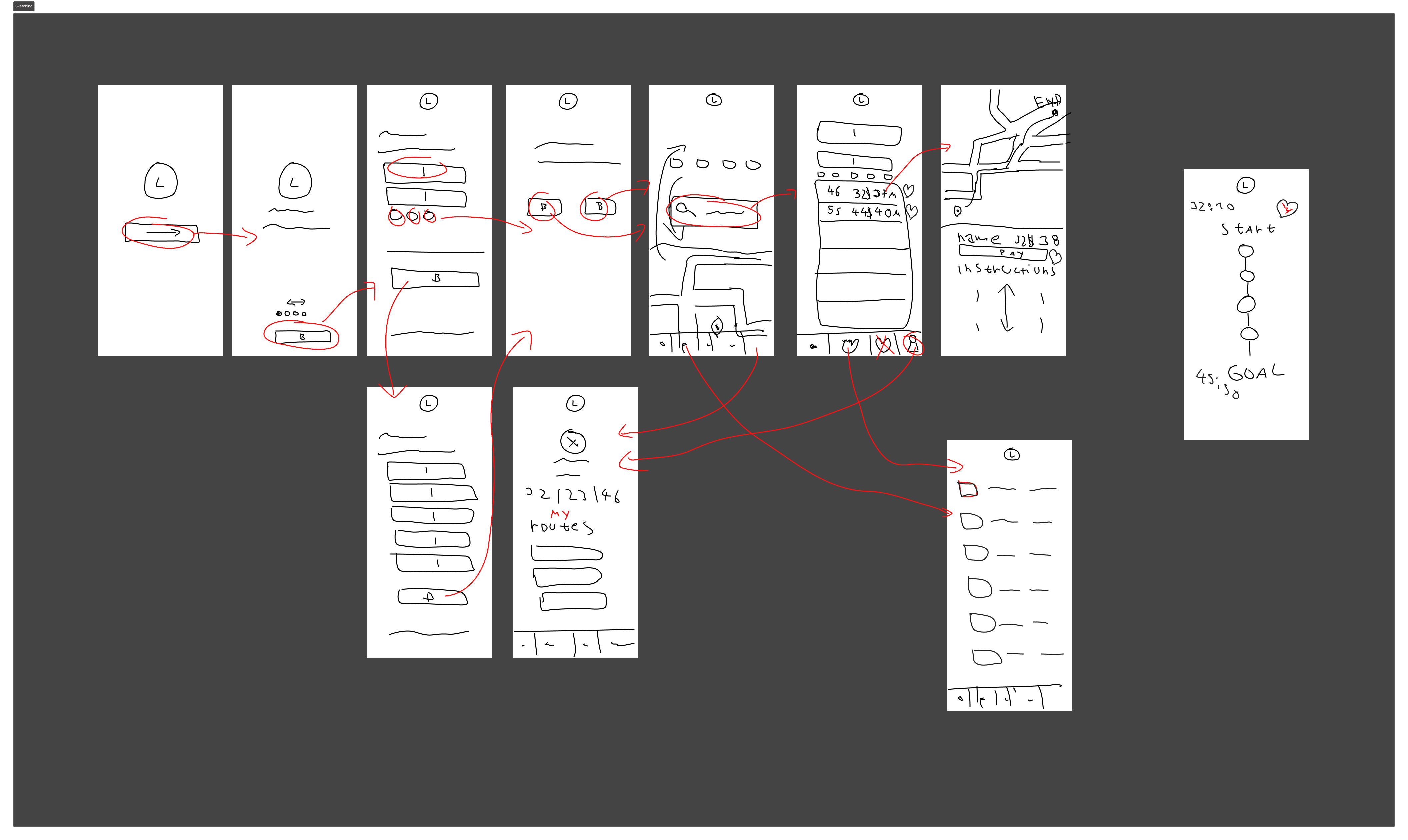
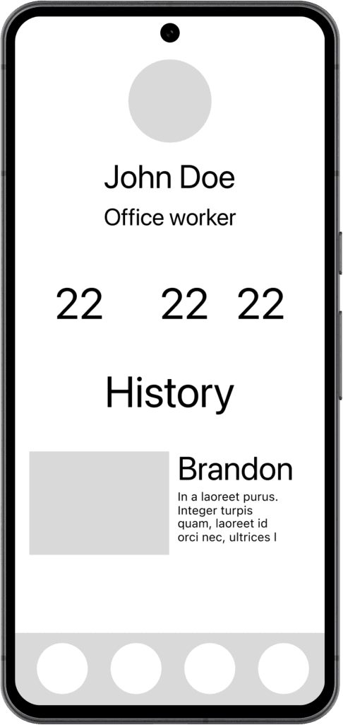
I discovered the importance of iterative design, utilizing low fidelity wireframes to test ideas and high fidelity wireframes to refine them.
3 - Design Simplicity
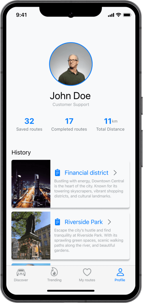
I discovered that a well-designed visual aesthetic not only enhances the app's appearance, but also leads to a more engaging and delightful user experience. Incorporating high-resolution visuals, updated typography, and deliberate color choices improved the app's overall appeal and usefulness.
Conclusion
This project provided an in-depth learning experience in implementing user-centered design principles, balancing usefulness and aesthetics, and effectively expressing design ideas.
THANK YOU
